A Masked Input field is a special input that visually obfuscates characters to protect sensitive information by masking them with a circular shape.
Usage
When to use
To give users a way to show and hide sensitive information.
When a form input with the ability to mask its value temporarily is needed.
When not to use
For passwords, use the Password input instead.
Masked input vs Password input
The Masked Input is a text field designed to protect sensitive or confidential information while allowing users to show or hide the input value as needed.
The password input is a specific type of form control designed for the secure entry of passwords. The value is always masked or hidden to prevent others from reading the entered characters easily. Unlike the Masked Input, the password input has specific attributes to enhance the security and confidentiality of passwords.
Usage examples
Use the Masked Input to protect sensitive values like secret keys or tokens.
Use the Masked Input to protect sensitive values like variables and certificates from unintended exposure.
Don’t use a Masked Input for password input. Use the Password input.
Multiline
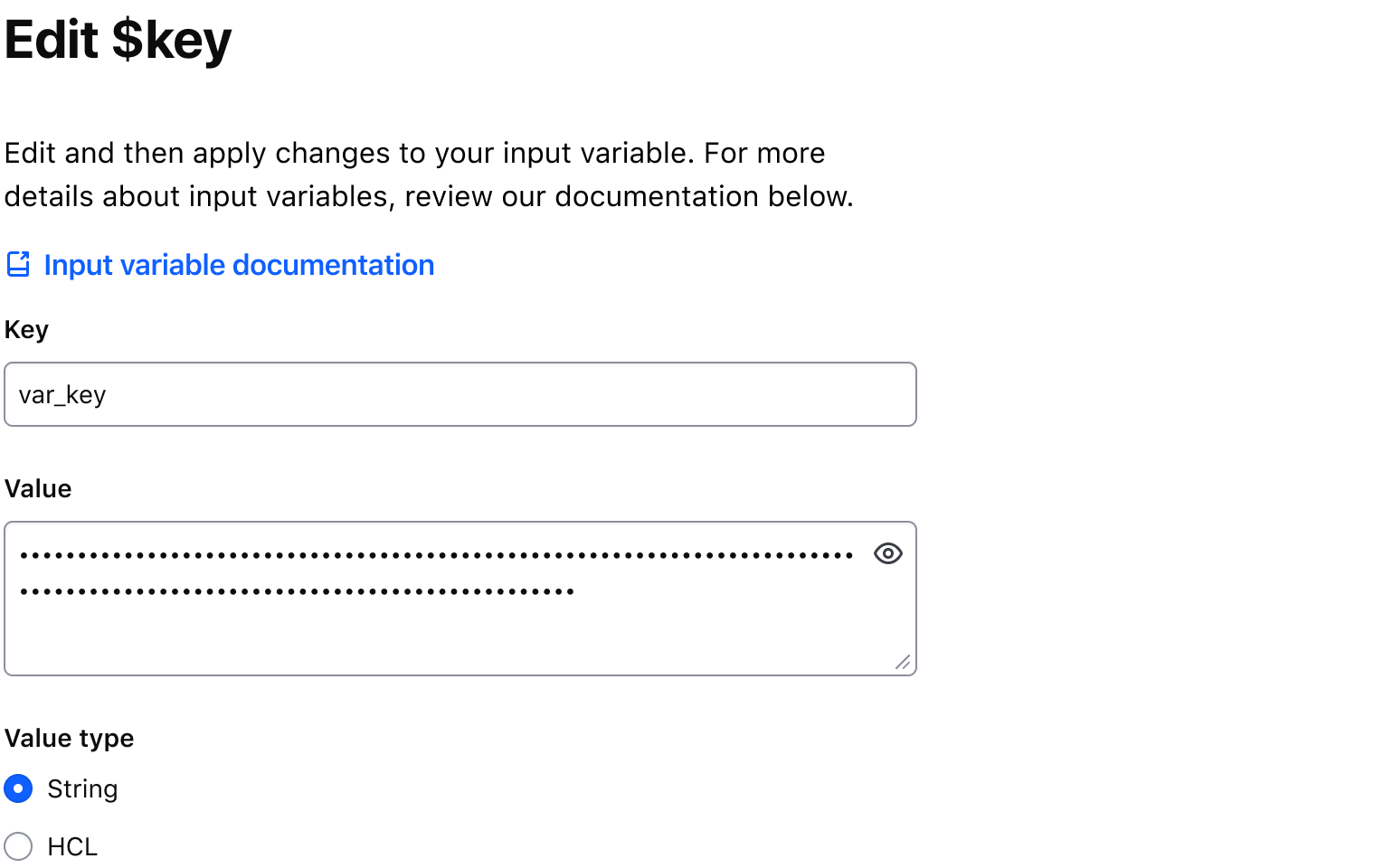
Use isMultiline to display multiline textual content. e.g., a Terraform variable. This property replaces the TextInput with a Textarea field.
Required and optional
For complex forms, indicate required fields. This is the most explicit and transparent method and ensures users don’t have to make assumptions. Read more about best practices for marking required fields in forms.
For shorter, simpler forms, indicate optional fields instead.
Copying the Masked Input value
Setting the hasCopyButton property to true will display a Copy Button adjacent to the Masked Input, allowing users to copy the value in the Masked Input to their clipboard. Refer to the Copy Button usage guidelines for more details around copying content.
Character count
For tracking the number of characters entered into a MaskedInput and defining requirements around minimum and maximum length, refer to the Character count documentation.
Error validation
For error validation recommendations, refer to the Form patterns documentation.
Content
For high-level content recommendations, refer to our Primitives documentation.
How to use this component
There are two ways to use the Masked Input component:
Form::MaskedInput::Base- the base component: the input control with a toggle button.Form::MaskedInput::Field- the field component: the input control with a toggle button, a label, helper text, and error messaging (in a wrapping container).
We recommend using the Field component as it provides built-in accessibility functionality. Use the Base component to achieve custom layouts or for special use cases not covered by the Field component.
Form::MaskedInput::Field
The basic invocation requires a Label. This creates:
- a
<label>element with aforattribute automatically associated with the inputIDattribute. - a
<input type="text">or a<textarea>control with an automatically generatedIDattribute.
<Hds::Form::MaskedInput::Field as |F|>
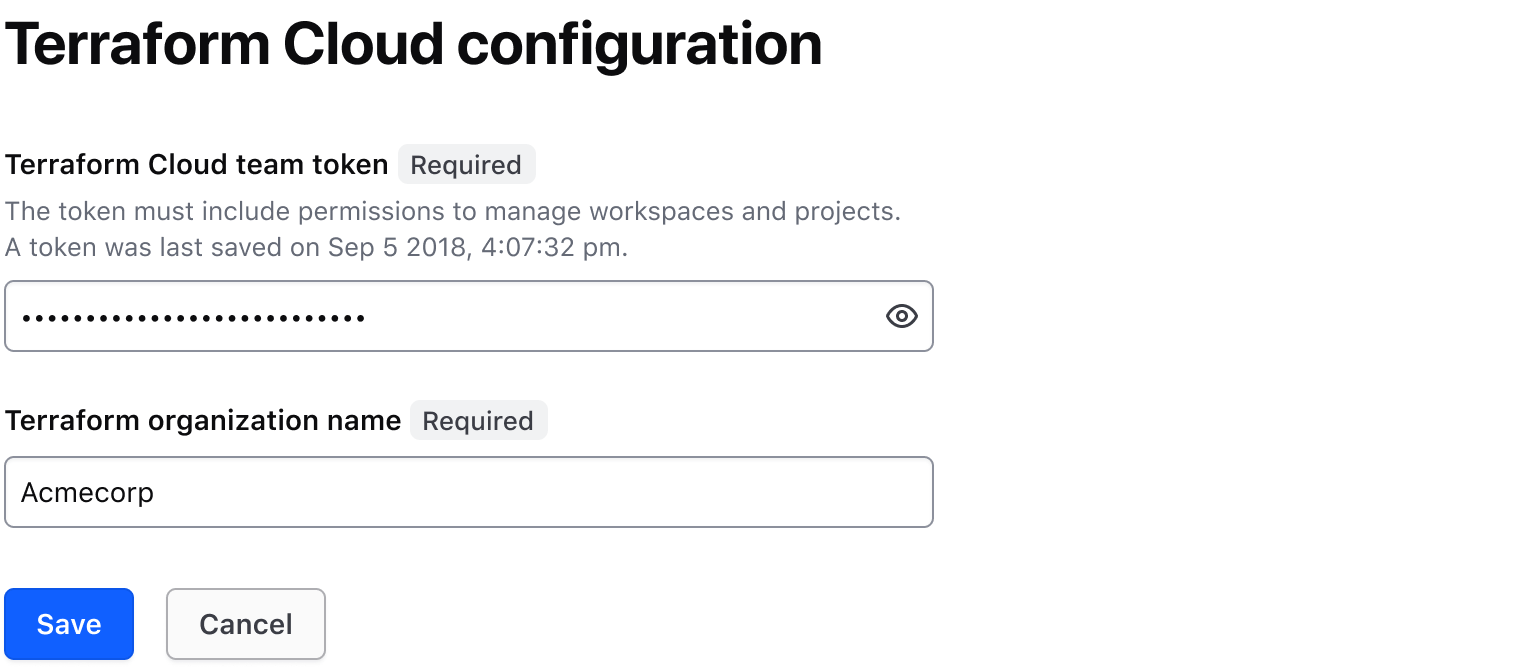
<F.Label>Terraform Cloud team token</F.Label>
</Hds::Form::MaskedInput::Field>
Input value
Pass a @value argument to pre-populate the input. By default, the content is visually obfuscated ("masked") and users can make it visible using the associated toggle button.
<Hds::Form::MaskedInput::Field @value="036215df4996ca649928d8864b4df9e42cba0d6d" as |F|>
  <F.Label>Terraform Cloud team token</F.Label>
</Hds::Form::MaskedInput::Field>
If you need to make the content visible by default or control the masking from outside the component, use the @isContentMasked argument.
<Hds::Form::MaskedInput::Field @isContentMasked= @value="036215df4996ca649928d8864b4df9e42cba0d6d" as |F|>
<F.Label>Terraform Cloud team token</F.Label>
</Hds::Form::MaskedInput::Field>
Multiline
Set @isMultiline argument to true to render a <textarea>
<Hds::Form::MaskedInput::Field @isMultiline= @value="-----BEGIN RSA PRIVATE KEY-----
MIIBOgIBAAJBAKj34GkxFhD90vcNLYLInFEX6Ppy1tPf9Cnzj4p4WGeKLs1Pt8Qu
KUpRKfFLfRYC9AIKjbJTWit+CqvjWYzvQwECAwEAAQJAIJLixBy2qpFoS4DSmoEm
o3qGy0t6z09AIJtH+5OeRV1be+N4cDYJKffGzDa88vQENZiRm0GRq6a+HPGQMd2k
TQIhAKMSvzIBnni7ot/OSie2TmJLY4SwTQAevXysE2RbFDYdAiEBCUEaRQnMnbp7
9mxDXDf6AU0cN/RPBjb9qSHDcWZHGzUCIG2Es59z8ugGrDY+pxLQnwfotadxd+Uy
v/Ow5T0q5gIJAiEAyS4RaI9YG8EWx/2w0T67ZUVAw8eOMB6BIUg0Xcu+3okCIBOs
/5OiPgoTdSy7bcF9IGpSE8ZgGKzgYQVZeN97YE00
-----END RSA PRIVATE KEY-----" as |F|>
<F.Label>Private key</F.Label>
</Hds::Form::MaskedInput::Field>
Copy button
To allow users to copy the input value to their clipboard, set the @hasCopyButton argument to true.
<Hds::Form::MaskedInput::Field @hasCopyButton= @value="036215df4996ca649928d8864b4df9e42cba0d6d" as |F|>
<F.Label>Terraform Cloud team token</F.Label>
</Hds::Form::MaskedInput::Field>
Helper text
You can add extra information to the field using helper text. When helper text is added, the component automatically adds an aria-describedby attribute to the input control, associating it with the automatically generated ID of the helper text element.
<Hds::Form::MaskedInput::Field @value="036215df4996ca649928d8864b4df9e42cba0d6d" as |F|>
  <F.Label>Terraform Cloud team token</F.Label>
  <F.HelperText>The token must include permissions to manage workspaces and projects.</F.HelperText>
</Hds::Form::MaskedInput::Field>
Extra content in label and helper text
The Label and HelperText contextual components used in the Field component yield their content. This means you can also pass structured content.
<Hds::Form::MaskedInput::Field as |F|>
  <F.Label>Terraform Cloud team token <Hds::Badge @size="small" @text="Beta" /></F.Label>
  <F.HelperText>The token must include <Hds::Link::Inline @href="#">permissions to manage workspaces and projects</Hds::Link::Inline>.</F.HelperText>
</Hds::Form::MaskedInput::Field>
Required vs. optional
Use the @isRequired and @isOptional arguments to add a visual indication that the field is "required" or "optional".
<Hds::Form::MaskedInput::Field @isRequired= as |F|>
<F.Label>Terraform Cloud team token</F.Label>
<F.HelperText>The token must include permissions to manage workspaces and projects.</F.HelperText>
</Hds::Form::MaskedInput::Field>
<br />
<Hds::Form::MaskedInput::Field @isOptional= as |F|>
<F.Label>Terraform Cloud team token</F.Label>
<F.HelperText>The token must include permissions to manage workspaces and projects.</F.HelperText>
</Hds::Form::MaskedInput::Field>
Character count
If the user input needs to be limited to a certain number of characters, use @maxLength on a CharacterCount contextual component to guide the user in meeting the length requirements. This property does not restrict the users from entering characters over the limit. To define the maximum string length that the user can enter, set maxlength attribute on the associated input field.