Form Primitives are used to compose form fields.
Form::Labelis the label associated with the form controlForm::HelperTextis an optional text used to help understand what the field is intended forForm::Erroris the error message shown in case of failed validation of the fieldForm::Indicatoris the indicator for "Required" or "Optional" inputsForm::Legendis the legend associated to the fieldsetForm::Fieldis the generic container for control, label, helper text and error messagingForm::Fieldsetis the generic container to group multiple fields with label, helper text, and error messagingForm::CharacterCountis optionally used to display the number of characters entered in a field, the maximum or minimum number of characters allowed, or a custom message communicating the relationship between the count and the maximum or minimum length.CharacterCountis only used in fields that accept text values (TextInput, Textarea, MaskedInput).
We use Form Primitives as the building blocks for the “field” and “group” controls. While we recommend using our pre-defined “field” and “group” controls because they provide built-in accessibility support, you can use the Form Primitives to implement custom layouts or controls as necessary.
Content
Form::Label
- We recommend keeping labels clear and concise, about 1-3 words. They should not consist of full sentences.
- 3.2.2 Labels or Instructions (A): Labels or instructions are provided when content requires user input.
Form::HelperText
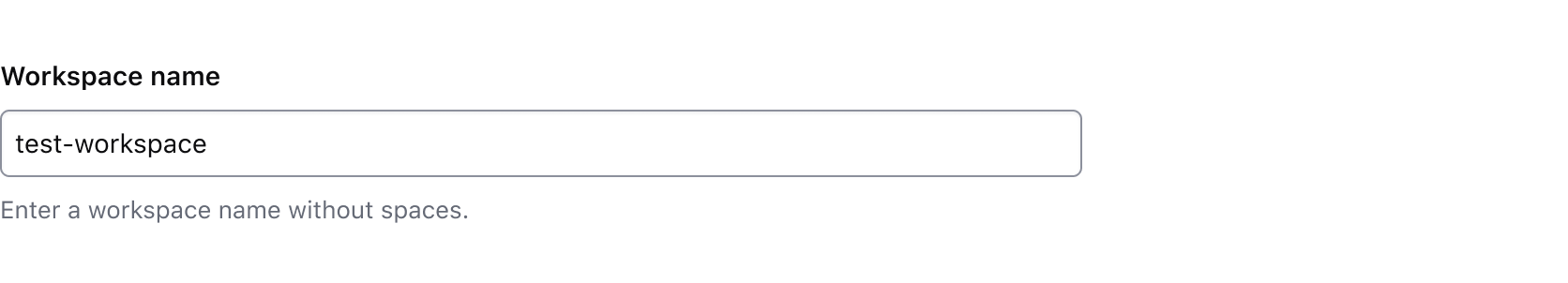
- Use helper text to give the user extra details about the data you’re asking them to input, e.g., formatting requirements such as MM-DD-YYYY.
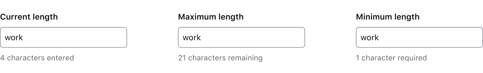
Form::CharacterCount
Use a character count to communicate the current length of the value in an input and whether it meets or exceeds the length requirements passed to the component. The component accepts multiple arguments to set length requirements and exposes several computed values to support custom messages. Visit the code documentation for more details.
Default messages
Depending on which property (or properties) are passed to the component, a different default message will be displayed by the component to communicate the relationship between the current length of the input value (currentLength) and the maximum length (maxLength), minimum length (minLength), or both.
Test and interact with the default messaging examples in the code documentation.
The default messages provide a consistent messaging pattern for the component by clearly communicating length requirements to the user while displaying their progress towards meeting the requirements.
Usage in Figma
For representative consistenty, the Figma component mirrors the default messages that are rendered in the Ember component and are labelled as such; currentLength (the default variant), maxLength, minLength, and custom.
In all variants except the custom variant, we recommend only overriding the numerical value (e.g., "{numerical value} characters is allowed"). Overriding the text in these variants will require a custom implementation on the engineering side, instead, the custom variant should be used.
Custom messages
A custom message in the character count is supported and can be used when a product or application-specific message or term is required, e.g., "registry" or "workspace".
Avoid presenting duplicate information between the helper text and the character count. Helper text should be used to provide persistent requirements while character count represents more of a progress indicator towards a length requirement.
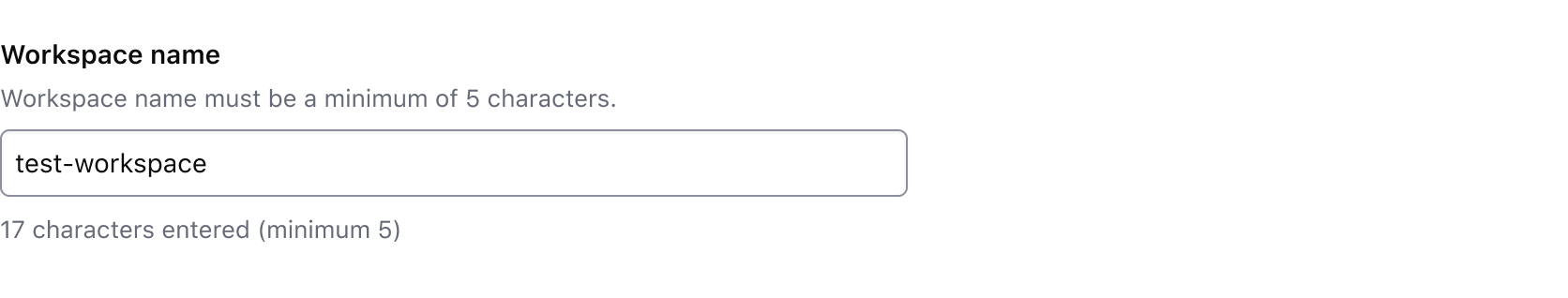
Don’t use the character count to display static details about the field. Use helper text to provide extra details about the information being requested and the character count to communicate the user’s progress toward meeting the requirements.
Form::Error
- Error messages should provide the user with enough context to guide them in resolving the error.
- Keep labels and legends short and to the point (ie. "Select one option")
- Avoid overt politeness; don’t use "please" or "thank you" in your messaging.
- 3.3.1 Error Identification: If an input error is automatically detected, the item that is in error is identified and the error is described to the user in text.
- 3.3.3 Error Suggestion (AA): If an input error is automatically detected and suggestions for correction are known, then the suggestions are provided to the user, unless it would jeopardize the security or purpose of the content.
- 3.3.4 Error Prevention (Legal, Financial, Data) (AA): For Web pages that cause legal commitments or financial transactions for the user to occur, that modify or delete user-controllable data in data storage systems, or that submit user test responses, at least one of the following is true: submissions are reversible, data is checked and the user is provided an opportunity to correct them, a mechanism is available for reviewing, confirming, and correcting the information before finalizing the submission.
- 4.1.3 Status Messages: In content implemented using markup languages, status messages can be programmatically determined through role or properties such that they can be presented to the user by assistive technologies without receiving focus.
How to use this component
Form::Label
The default invocation requires text to be passed and a controlId argument (the ID of the form control associated with the label).
<Hds::Form::Label @controlId="control-ID">
  My label
</Hds::Form::Label>
Pass an isRequired argument, when user input is required for the associated form control.
<Hds::Form::Label @controlId="control-ID" @isRequired=>
My label
</Hds::Form::Label>
Pass an isOptional argument, when the user input is optional for the associated form control.
<Hds::Form::Label @controlId="control-ID" @isOptional=>
My label
</Hds::Form::Label>
If the label needs to contain more than just text, it’s possible to pass structured content to component. While the correct text styling is applied to the component’s container, the layout of the content inside the component is the responsibility of the product team.
<Hds::Form::Label @controlId="control-ID">
  <span>Some text</span>
  <Hds::Badge @size="small" @text="Some badge" @color="highlight" />
</Hds::Form::Label>
Form::HelperText
The default invocation requires text to be passed and a controlId argument.
The controlId value is used to generate an ID, prefixed with helper-text-, so that the ID can be referenced in the aria-describedby attribute of the form control. If no controlId is provided, no ID is generated. If needed, it can be passed directly as an HTML attribute.
<Hds::Form::HelperText @controlId="helper-text-first">
  This is some helper text
</Hds::Form::HelperText>
If the helper text needs to contain more than just text, use the block form of the component. While the correct styling is applied to the component itself, the nested components may need additional styling and are the responsibility of the product team.
some formatted code
or a strong message.
<Hds::Form::HelperText @controlId="control-ID">
  Some text with a
  <Hds::Link::Inline @route="show" @model="components/link/inline">
  Hds::Link::Inline</Hds::Link::Inline>,
  or <code>some formatted code</code>
  or a <strong>strong message</strong>.
</Hds::Form::HelperText>
Form::CharacterCount
The default invocation requires a controlId argument referencing a valid <input> or <textarea> element.
The controlId value is used to generate an ID, prefixed with character-count-, so that the ID can be referenced in the aria-describedby attribute of the form control.